妙妙怪的《CSS 揭秘》读书摘要
看这本书前:看书,现在短视频时代,正经人谁看书啊,要看也是看视频教程和大佬博客啊!
看完这本后:似乎有一点香!(轻松有趣)
从这本书字里行间可以感受到作者也是个有趣的灵魂。
看了这本书知识浅显易懂、挺有趣的,重新让我拾回看书的一些兴趣;
这本书让我感受到 CSS 一些巧妙的技巧,故摘抄以便往后快捷运用。
背景与边框
多重边框
css
box-shadow: 0 0 0 10px #655, 0 0 0 15px deeppink, 0 2px 5px 15px #ccc;
灵活的背景定位
css
background-position:right 20px bottom 10px;//离右侧20px、下边10px
background-position:calc(100%-20px) calc(100%-10px);
background-origin:content-box;//以内容盒为准
边框内圆角
css
background: tan;
border-radius: .8em;
padding: 1em;
box-shadow: 0 0 0 .4em #655;//扩张半径取圆角的一半
outline: .4em solid #655;
条纹背景
css
//横向
background: linear-gradient(#fb3 33.3%, #58a 0, #58a 66.6%, #ccc 0);
background-size: 100% 20px;
//垂直
background: linear-gradient(to right, #fb3 33.3%, #58a 0, #58a 66.6%, #ccc 0);
background-size: 20px 100%;
//斜向
background: linear-gradient(45deg, #fb3 25%, #58a 0, #58a 50%, #ccc 0, #ccc 75%, #58a 0);
background-size: 100%;
//重复任意角度条纹
 background: repeating-linear-gradient( 60deg, #fb3, #fb3 15px, #58a 0, #58a 30px);
形状
圆角
css
border-radius:水平半径/垂直半径
border-radius: 50% / 100% 0;//树叶形状
border-radius: 100% 0 0 100%/50%; //半椭圆
border-radius: 100% 0 0 0;//四分之一椭圆
平行四边形
css
/*按钮内容不行变解决方案*/
button {
        position: relative;
        background: transparent;
        outline: none;
        border: none;
        padding: 10px 20px;
        margin-left: 50px;
        z-index: 1;
    }

    button::after {
        position: absolute;
        content: '';
        top: 0;
        left: 0;
        bottom: 0;
        right: 0;
        width: 90px;
        height: 35px;
        display: block;
        background: #5C7AEA;
        transform: skewX(-30deg);
        z-index: -1;
    }
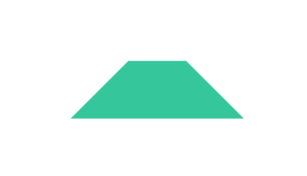
梯形
css
.box {
    width: 100px;
    height: 100px;
    background: rgb(52, 199, 155);
    margin: 200px auto;
    position: relative;
    font-size: 40px;
    color: #fff;
    line-height: 100px;
}
.box::before {
    position: absolute;
    top: -100px;
    left: -100px;
    display: block;
    content: '';
    width: 0;
    height: 0;
    z-index: -1;
    border: 100px solid transparent;
    border-bottom-color: rgb(52, 199, 155);
}
.box::after {
    position: absolute;
    top: -100px;
    right: -100px;
    display: block;
    content: '';
    width: 0;
    height: 0;
    z-index: -1;
    border: 100px solid transparent;
    border-bottom-color: rgb(52, 199, 155);
}
视觉效果
投影大致原理:
box-shadow: 2px 3px 4px rgba(0, 0, 0, .5);
- 画该元素相同尺寸、位置、指定颜色的矩形
- 按指定的 x、y 进行水平垂直位移
- 按指定模糊半径,使用高斯模糊算法进行处理
- 切除与原始元素交集部分
双侧投影
css
box-shadow: 5px 0 5px -5px #000,-5px 0 5px -5px red
染色效果
css
img {
    filter: sepia(1) saturate( 4) hue-rotate( 295deg);
}
毛玻璃
IE 不支持 Chrome 大于等于 76 Edge 大于等于 17 Firefox 70 至 94
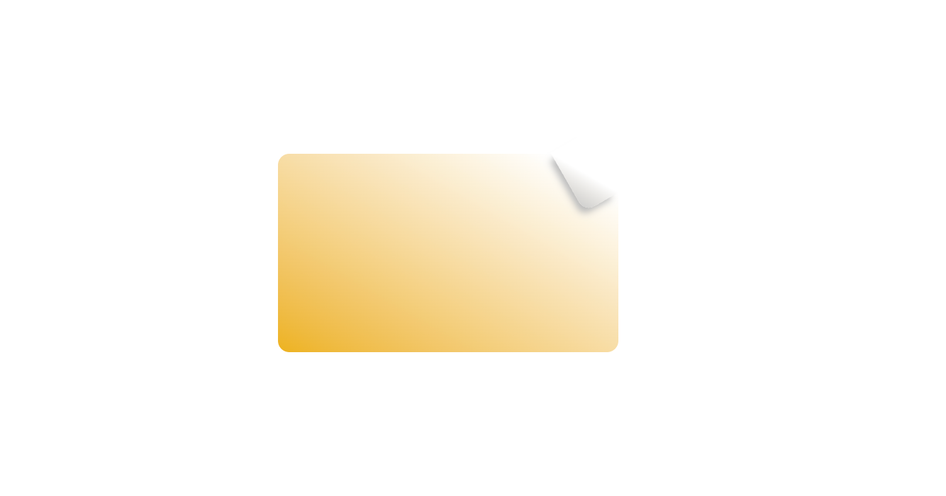
折角效果
css
box {
            width: 200px;
            height: 100px;
            margin: 100px;
            padding: 20px;
            position: relative;
                 border-radius: .5em;
            background: linear-gradient(210deg, transparent 1.5em, #edb21d);
        }

        .box::before {
            content: '';
            position: absolute;
            top: 0;
            right: 0;
            width: 1.73em;
            height: 3em;
            background: linear-gradient(240deg, transparent 50%, #ccc);
            transform: translateY(-1.3em) rotate(-30deg);
            transform-origin: bottom right;
            border-bottom-left-radius: inherit;
            box-shadow: -0.3em 0.2em 0.3em -0.1em #bbb;
        }
折角效果 mixin 预处理器
css
@mixin folded-corner($background,$size,$angle:30deg){
    position:relative;
    background:$background;
    background:linear-gradient($angle - 180deg,
        transparent $size,$background 0);
    border-radius: .5em;
    $x:$size / sin($angle);
    $y:$size / cos($angle);

&::before{
    content: '';
    position: absolute;
    top: 0;right: 0;
    background: linear-gradient(to left bottom,
        transparent 50%,
        rgba(0,0,0,.2) 0,
        rgba(0,0,0,.4)) 100% 0 no-repeat;
    width:$y;height:$x;
    transform:translateY($y-$x) rotate(2*$angle - 90deg);
    transform-origin:bottom right;
    border-bottom-left-radius:inherit;
    box-shadow:-.2em .2em .3em -.1em rgba(0,0,0,.15);
}
}
/*当调用时...*/
.note{
    @include folded-corner(#68d,1.3em,60deg);
}
字体排印
插入换行
css
hyphens:manual; / *手工设定。默认值,只有单词中有建议换行符才会换行,即手工在单词中插入 * /
hyphens:none; / *无。即使单词中有换行符,也不会换行,只会在空白处换行* /
hyphens:auto; / *自动。浏览器在适当的位置自动插入连字符换行* /可以结合选择器
+ / ~ / not(:first-child)实现在元素后面添加,/ 换行符
css
dd+dt::before{
content:'\A';
/*content:',';*/
white-space:pre;/*空白会被浏览器保留*/
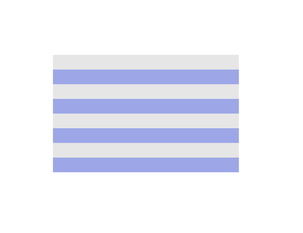
}文本行斑马线
css
.box{
     padding: 0 .5em;
    line-height: 1.2;
    background: hsl(184, 61%, 76%);
    background-image: linear-gradient( rgb(230, 230, 230) 50%, transparent 0);
    background-size: auto 50%;
    background-origin: content-box;
    font-family: Consolas, Monaco, monospace;
}
自定义下划线
css
.box{
    background: linear-gradient(gray, gray) no-repeat;
    background-size: 100% 1px;
    background-position: 0 1.15em;
    text-shadow: .05em 0 white, -.05em 0 white;
}
凹凸印刷文字效果
css
text-shadow: 1px 1px 1px #000, -1px -1px 1px #fff;//凸
text-shadow: -1px -1px 1px #000, 1px 1px 1px #fff;//凹
满幅背景、定宽内容(页脚)
css
footer{
    max-width:1000px;
    padding:1em calc(50%-500px)
}
紧贴底部的页脚
css
body{
display:flex;
flex-direction:column;
min-height:100vh;
}
main{
flex:1;
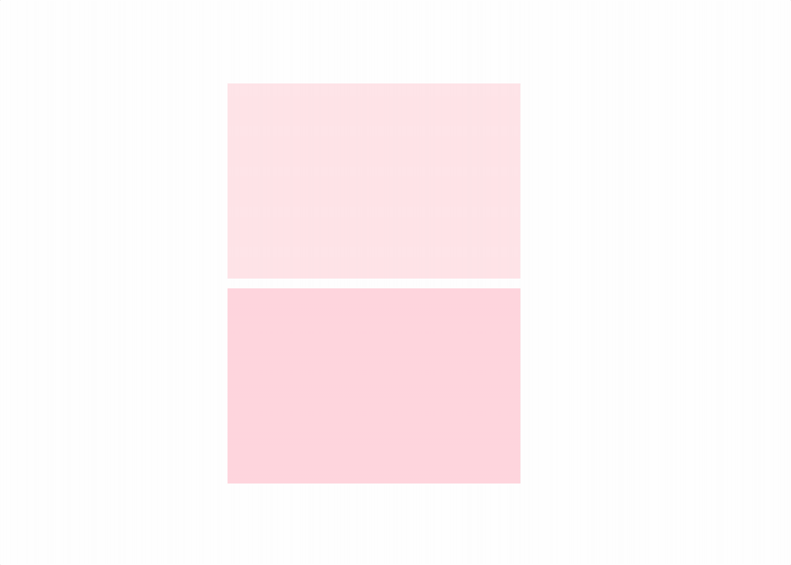
}闪烁效果
css
.box{
  background-color:  pink;
  animation: twinkle 0.5s infinite steps(2) alternate;/*普通闪烁*/
  animation: twinkle 0.5s infinite   alternate;  /*真实闪烁*/
}
@keyframes twinkle {
  0% {
    opacity: 1;
  }
  100% {
    opacity: 0;
  }
}